As someone who teaches user experience, among other things, this session at MozFest 22 was particularly interesting for me. What I knew as persuasive design, addictive design, and emotional design, all of which I found unethical, are now called ‘dark patterns’.

Dark Patterns refer to interface design tactics in digital products to persuade one into doing things one would otherwise not do. It has been so commonly used in today’s online tools, platforms, and services without questioning that such practices have become defaults-by-design. Despite the rising public outcry against the manipulative nature of Dark Patterns and its contribution to undermining people’s agency and human rights online, efforts to restrain Dark Patterns remain mono-lateral, often through the policy channel. However, shifting the culture of Dark Patterns takes a much more comprehensive approach that involves a key stakeholder: the user research and design community.
Dark Patterns refer to interface design tactics in digital products to persuade one into doing things one would otherwise not do
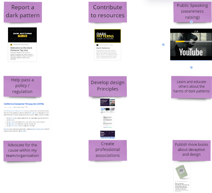
For decades, the design community has been through many iterations to define “ethical design” and set a standard on what is good design. In this workshop, the organizers offered a redefinition of “ethical design” by providing a human-rights-centered design approach. Built upon a cross-disciplinary working session between designers, policy experts, and researchers to list simple actions to prevent Dark Patterns, in this workshop, the organizers of this session introduced a guide for designers to navigate through design choices while prioritizing human rights. The session aimed at collectively brew practices and concerns that are key to building a culture against Dark Patterns and protect people’s privacy and other digital rights as technology evolves.
The following is mostly the practices and concerns as noted from the session in a live document organized by Tech Design Lab:
The term ‘dark patterns’ was coined by Harry Brignull in 2010. Today, researchers and professionals also refer to it using terms like “deceptive designs” while in public it is sometimes portrayed as “poor designs” or “asshole designs,” which express the public sentiment towards this kind of ‘features’ of a product.
Harms: Why dark patterns? Companies want from you anything they can capitalize: money, personal data, traffic brought by your clicks and actions. But the tactics they use are not benign. As a result, you could:
- Lose money
- They can sneak additional items into your cart when you checkout, mislead you to pay for things you don’t want, or make it super difficult to cancel a paid subscription.
- Lose privacy
- They can trick you into giving your personal information, or silently steal your data, and sell them to advertisers.
- Gain mental burden
- You can feel bombarded, exhausted in attempting to claim your rights, or deceived. It often takes a lot from you to seek remedy.
- Preying on disadvantaged groups such as those who speak English as a second language or have little means catching up with evolving tech.
How to spot dark patterns:
- Learning to recognize different types of dark patterns can help you navigate the web and mobile apps more cautiously, spotting settings and boxes that deserve a closer look. If you know the kind of common psychological tricks played in interface design, you’re less likely to have them trick you
- This can be as easy as learning that an “unsubscribe” email link is often found in small, faint type at the bottom of a screen.
- Getting familiar with type of dark patterns makes it easier to stop them going forward but here are some tips of what to look for:
- Bewildering language, labels, or buttons that make it appear to say one thing when they actually mean something else
- Crowded visuals, long lists, or extra steps that are meant to make you tired and quickly click through
- Confusing navigation that forces you to give up
To learn more about dark patterns:
- Watch: Dark Patterns: User Interfaces Designed to Trick People
- Read: a bill to prohibit deceptive design in the US: S. 1084 (116th): Deceptive Experiences To Online Users Reduction Act and H.R.2683 — 116th Congress (2019-2020)
- Case study: Age of Learning Inc. The Federal Trade Commission
- Deceptive Design patterns. Mozilla


